The best kitchen color ideas start with what you cannot easily change. Countertops, flooring and the backsplash usually stay put for years, while wall paint can change in a weekend. Build your palette around the fixed pieces, then use paint to set the mood.
Below you will find palettes that hold up over time, bolder options for people who want a kitchen with personality, a simple method for pairing walls, cabinets and backsplash, and a guide to paint finishes, which matter more in a kitchen than in any other room.
Start with the fixed elements
Before you look at a single paint chip, take stock of what is staying. Look at the undertone of each surface, not only its color. A granite counter that reads beige may lean pink, gold or green. Oak cabinets lean orange or yellow. White quartz can be cool and bluish or warm and creamy.
Hold paint samples directly against these surfaces, in daylight and at night under your own bulbs. A shade that looks right in the store can turn muddy next to a warm wood floor. Large painted sample boards, moved around the room over a couple of days, give a far better read than small chips.
Neutral kitchen color ideas that last
Neutrals are popular for a reason: they work with almost any cabinet, floor or counter, and they make a kitchen easier to update later with accessories.
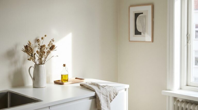
- Warm white. A white with a touch of yellow or red feels soft and welcoming, especially next to wood. It avoids the clinical look of a stark white.
- Crisp white. A cleaner white suits modern kitchens with flat-panel cabinets, stainless steel and gray or black counters.
- Greige. The mix of gray and beige bridges warm and cool materials, which helps when your floor and counters disagree.
- Soft gray. Choose one with a warm or green undertone if the room gets little natural light, since cool grays can look cold in shade.
- Mushroom and taupe. These deeper neutrals give a room warmth without committing to a real color.
The risk with an all-neutral kitchen is flatness. Vary the texture rather than the color: a matte wall, a glossy tile, a wood cutting board, a linen towel. That contrast keeps a quiet palette from feeling bland.
Bold and colorful kitchen paint ideas
Color brings character to a kitchen fast, and paint is the cheapest way to try it. A few directions that work well:
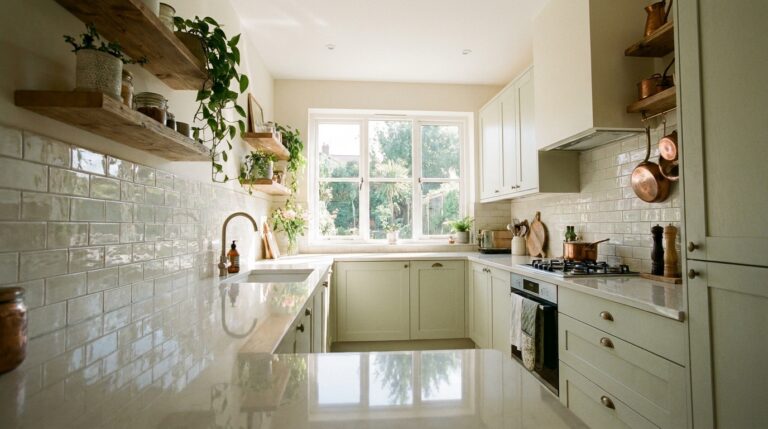
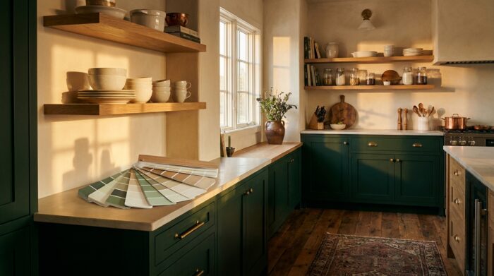
- Sage and olive green. Muted greens pair with wood, brass and white tile, and they bring a natural feel without overwhelming the room.
- Navy and deep blue. A strong choice for lower cabinets or an island, paired with white uppers and brass or nickel hardware.
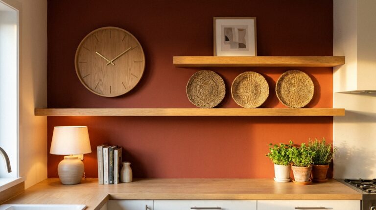
- Terracotta and clay. Earthy reds and oranges suit Mediterranean and rustic kitchens, especially with natural stone or plaster.
- Butter yellow. A pale, soft yellow makes a north-facing kitchen feel sunny without the glare of a bright lemon tone.
- Charcoal and black. Dark walls or cabinets look dramatic and modern, as long as the room has enough light and a few light surfaces to balance them.
If a full wall of color feels like too much, test it on a smaller surface first: the island, the inside of open shelving, the back of a glass-front cabinet or the trim around a window.
How to pair walls, cabinets and backsplash
A kitchen has more painted and finished surfaces than most rooms, so it helps to plan them together. The classic 60-30-10 rule from interior design is a reliable starting point: about 60 percent of the room in a dominant color, 30 percent in a secondary color, 10 percent in an accent.
| Palette | Walls (60%) | Cabinets (30%) | Accent (10%) |
|---|---|---|---|
| Classic and calm | Warm white | Sage green | Brass hardware, wood shelves |
| Coastal | Soft white | Navy lowers, white uppers | Blue-green tile, natural fiber stools |
| Modern contrast | Light gray | Matte black or charcoal | Warm wood, white quartz |
| Warm earthy | Creamy beige | Natural wood | Terracotta tile, olive green textiles |
| Tonal | Pale greige | A deeper greige or taupe | Stone counters, black fixtures |
The backsplash usually sits between the walls and the cabinets visually, so let it do one job. A busy patterned tile should pull its colors from the rest of the room. A strong colored tile works best with quiet walls and cabinets. If the backsplash is plain white, you have more freedom with the wall color.
Repeat each color at least twice in the room. A green cabinet looks intentional when a green towel, plant or bowl answers it on the other side of the kitchen.
Color ideas for a small kitchen
In a small kitchen, color decisions carry more weight because every surface is in view at once. Light colors reflect more light and make walls appear to recede, which is why whites and pale neutrals remain the safe choice. Painting walls, trim and cabinets in the same light shade, or in close shades of one color, blurs the edges of the room and makes it feel larger.
Dark colors are not off limits, though. A tiny galley painted deep green from floor to ceiling can feel cozy and deliberate rather than cramped, provided the lighting is good. The mistake is using many unrelated colors in a small space, which breaks it into pieces. You will find more layout, storage and lighting tips in our kitchen ideas for small spaces.
Choosing the right paint finish
Kitchen walls deal with steam, grease and splashes, so the finish matters as much as the color. Sheen runs from flat to high gloss, and the shinier the finish, the easier it is to wipe clean, but the more it shows flaws in the wall.
| Finish | Look | Best kitchen use |
|---|---|---|
| Flat or matte | No shine, hides imperfections | Ceilings; walls only if labeled scrubbable |
| Eggshell | Slight glow | Walls away from the stove and sink |
| Satin | Soft sheen, wipes clean well | Most kitchen walls |
| Semi-gloss | Noticeable shine, very durable | Cabinets, trim, doors, walls behind the sink |
| High gloss | Mirror-like | Statement cabinets, trim, small accents |
For cabinets, use a paint made for cabinetry or trim, which levels out brush marks and cures to a harder surface. Proper prep (cleaning off grease, light sanding and a bonding primer) does more for durability than the paint itself.
Using wood, metal and stone as color
Paint is only part of a kitchen palette. Natural materials bring their own color, and they often decide whether a scheme feels warm or cool. Light oak and maple add a soft honey tone, walnut a deep brown, and painted cabinets next to a wood floor or butcher-block counter need to work with that warmth.
Metal finishes count too. Brass and gold warm up greens, blues and creamy whites. Chrome and stainless steel suit cool grays and crisp whites. Matte black works with almost anything and gives a pale kitchen some definition. Pick one main metal and repeat it on hardware, faucet and light fixtures, adding a second only as a small accent.
Stone and tile bring pattern and variation. A veined marble or quartz counter already contains several colors, which makes a good source for the wall shade: pull out the faintest gray or beige in the veining and paint the walls in it. The result looks cohesive without being matchy.
How light changes a color
The same paint looks different depending on the direction of the light. North-facing kitchens get cooler, indirect light, which can make grays look blue and whites look dull, so warmer shades help. South-facing kitchens get warm, strong light that brightens most colors and can make yellows look intense. Artificial light shifts color again in the evening, which is why testing samples at night matters as much as by day.
Frequently asked questions
What is the most timeless kitchen color?
White and warm off-white have stayed popular for decades because they suit any cabinet style and make it easy to change the look with hardware and accessories.
Should kitchen walls be lighter or darker than the cabinets?
Either works if there is clear contrast. Light walls with darker cabinets is the easier combination, while dark walls with light cabinets needs plenty of light.
What paint finish is best for kitchen walls?
Satin is the usual choice: it wipes clean without the strong shine of semi-gloss. Use semi-gloss behind the sink and on trim.
How many colors should a kitchen have?
Two or three main colors plus natural materials like wood and stone is plenty. More than that tends to look busy.